Recreational & Medical Cannabis
Design for ethics, Branding, Packaging


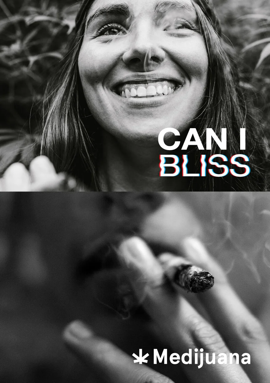


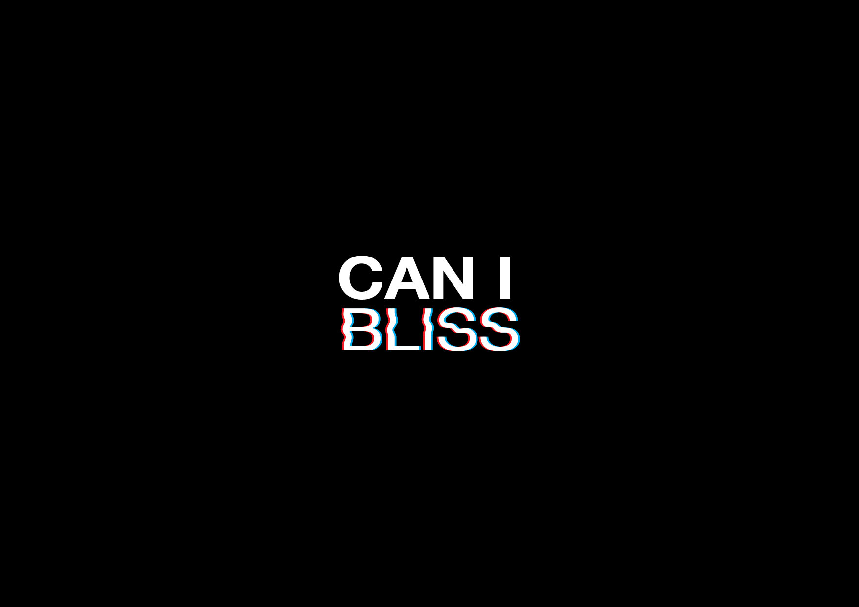
The name came from Cannabis and bliss. Which suited very well for a recreational cannabis brand. The logo were create towards bold and fun. The wave on the “bliss” were to represent high stage of consumption


An easy consumption zip lock packaging. Fun and blissing experience as a recreational cannabis represent through a holographic zip lock material. Minimal information is found through packaging suggestive a careless users.


A combination of word “Medical” and “Marijuna” created the name Medijuna as a Medical cannabis brand. The branding were aims towards a clean modern and minimalism. The symbol were inspired by Asterisk (*) and marijuana leaf which is only ideal represenatoin of marijuana.


Simple, informative and much more responsible in packaging labeling for CBD oil extraction packaging. The grainy gradient were inspired by the dusk and dawn which represents CBD product benefits - to relief pain, destress and potentially help in sleeping